How's Your Header? OR The FREE Twitter Header Collective
Your Twitter profile is like a virtual professional business card. It's good for people to see who you are (not your cat or your cute kids)
and what you’re all about. So why not make the most of your profile picture and header? Sure, I've talked before about 6 Tips to a Super Twitter Profile but today, we're just talkin headers, hon!
Not having ANYthing as a Twitter header is a missed opportunity. Plus, people checking your profile, deciding whether or not to follow you, may just not take you seriously. That's why having a banging professional Twitter header is easy and important.
1. Measure It!
Since they've added the NEW Twitter header feature back in 2014, the dimensions have pretty much stayed the same - 1500 X 500. BUT because of the way Twitter uploads photos there are some invisible areas, so the actual size is really more like 1500px (width) X 421px (height) Creating the perfect custom Twitter header image is a bit more complicated than it appears – it’s still easy to do, but you need to keep a few things in mind: The whole content of your image won’t always fit in the header since it automatically gets cropped and upscaled for some reason. You need to know the “visible” and “invisible” areas to make sure your followers can view what you want them to see in your header photo. See below for a template.
Also note: This is annoying and I don't know why, but you will lose the original quality of your image after uploading to Twitter. Fix: Use highest quality pixel images and save your work in its highest quality. It may still look a little muddy.
PHOTO Tip: When taking pictures for your Twitter header use landscape mode - or better yet, take a PANORAMA picture and then use PicMonkey to crop it to the right size and maybe add the text you want. (See the collective embedded below for directions & for some FREE Images to start with!)
IDEAS:
Take a Panorama of your library, classroom, front of your school, a bookstore, a beach, or any environment that speaks to you!
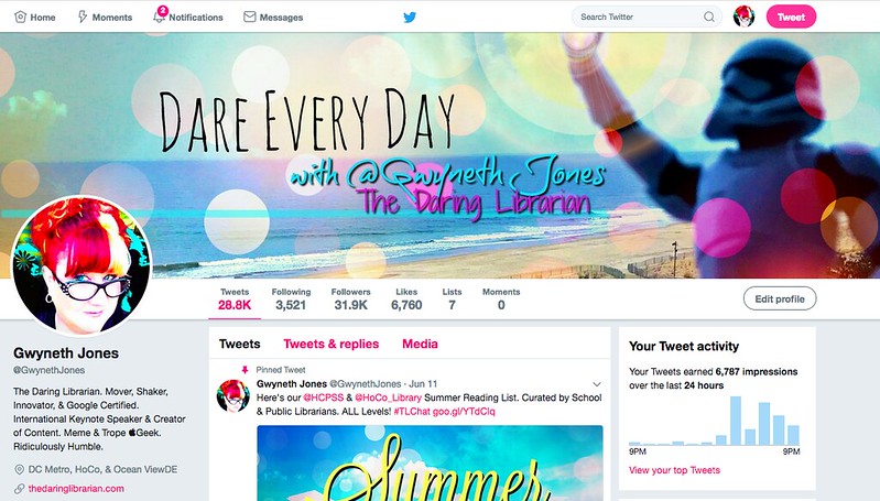
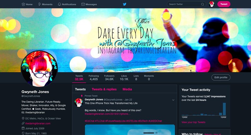
UPDATE: 2019 --Can you spot the change?
I added the word "Other" and I'm really digging the "Night Mode" of viewing Twitter. It relaxes me. Shocker. Against all advice and current web designer trends I've resisted going WHITE on this blog. I like the dark background. Always have. For years. Since like forever, don't judge me! LOL I find it both dramatic and easy on my eyes.
2. Brand It!
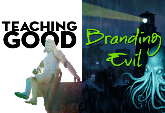
Teaching Good - Branding Evil
Wonder More - Fear Less
Creating the Daring Librarian Brand
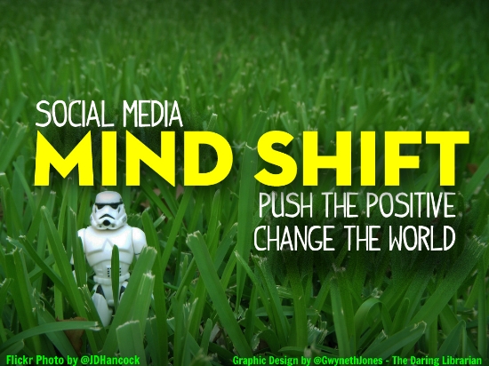
Social Media Mind Shift
I'll be posting more about it later (I did a guest post recently for someone that I'll be mirroring here) but your Twitter header is a GREAT way to establish your personal and visual brand.For those who are interested in establishing or building a personal brand, a Twitter header is a great place to promote. You can promote your blog, your school, your library, or your professional mission. If you have a book coming out, are speaking or keynoting at an event, make sure that you let your followers know about it via your cover photo. Not everyone will see your Tweet, but more will check your profile or hover on your handle to see your info.
If you’re just starting out, think of something that you’d like people to associate with you. Every change agent and influencer has their own “it” thing. Mine is daring. Whatever you choose, put it to work on Twitter!
IDEAS:
Brainstorm, visual map, sketch out, cartoon, or write up your professional mission statement. What's important to you? Consider making that your brand! Just never, ever, forget why we're here - for the kiddos we teach!
3. Grab It!
Don't have a Twitter header? Not sure what we're all talking about
and need some examples? Don't feel confident creating one yourself or a little hesitant playing with graphic design?
I gotcha, friend!
About a year ago I started a project, but as I can sometimes be a bit of a perfectionist, I didn't want to share it until it was perfect. But then maybe I'd never share it if I waited for THAT! LOL So, here it goes!
The FREE Twitter Header Collective
for Teachers, Librarians, Admins, & Readers
I created a FREE Twitter Collective on Google Slides where you can donate and ADD a header you've created (make sure to sign your name somewhere & make it Creative Commons) and you can TAKE a header by copying the whole Google Slide show to your Google drive or Download it as a PPT!
Directions are on the slideshow, I also uploaded a lot of these graphics on a Flickr Album!
Generously, some Twitter friends of mine have contributed to this project. You can contribute, too! I'd SO love that!
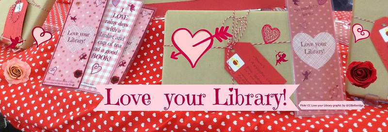
Donated to the collective by my dear Twitter friend from Perth, Australia: Sarah J Betteridge @SJBetteridge
Generously Donated by @Angela_LaPlante
I've also sourced, designed, & cropped to fit some cool Flickr Creative Commons photos for you!
Indianapolis Library - Photo by Serge Melki
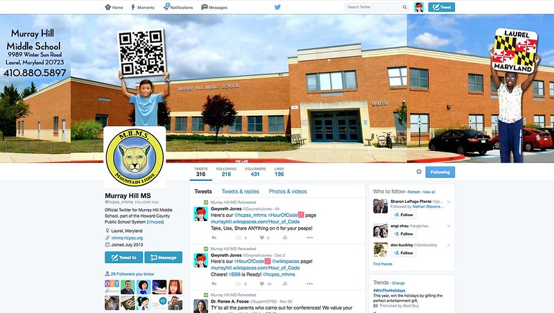
Here's the Twitter header I designed for my school, Murray Hill Middle. This is an example of how I used a patchwork collage effect highlighting some students, our community, and our state.
More resources:
Canva
Canva has "one of the best selections of Twitter header layouts on the web! You can use their incredibly simple design tool to create a professional Twitter header that will make your profile stand out among the best." -
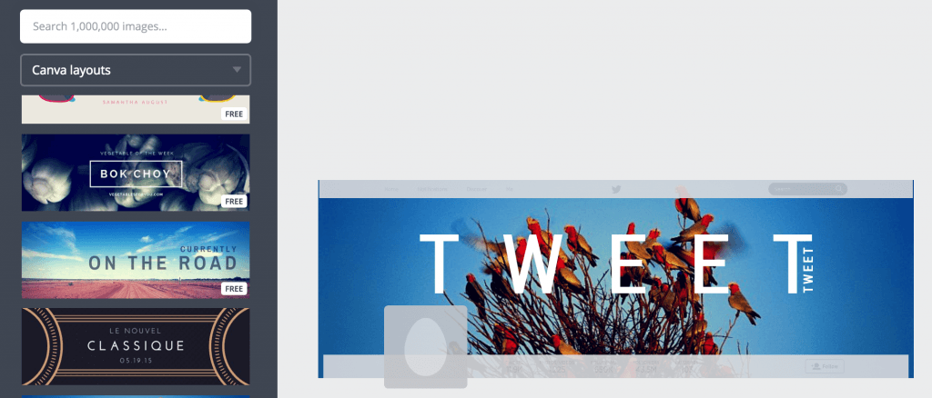
Read more: How to Use Canva to Design Amazing Graphics: It’s FREE and Easy







Comments
Post a Comment