Teaching Good - Branding Evil
Deep GEEK Disappointment!
After a deeply felt personal geek disappointment I changed the graphic design of my branding of the last few years from Doctor Who and the Tardis ….to, to, what!?
I don’t want to go deeply into how and why I am ditching Doctor Who (for now) but it involves some disappointment with the latest series, the latest doctor, and a couple vainglorious individuals. So, let's just say: Basically, I’ve soured.
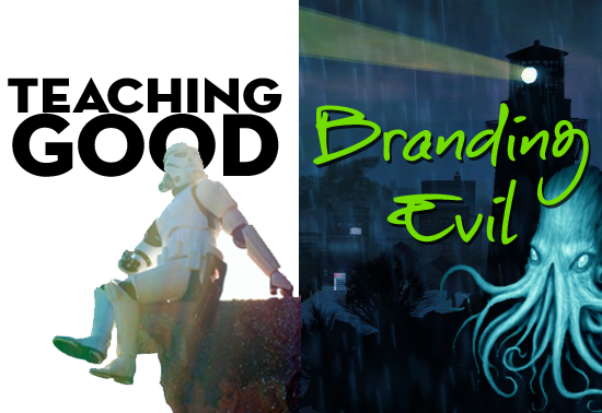
Teaching Good
Branding EVIL
Why am I telling you all this? Branding. People have asked me "why and how do I brand myself or should I?" And it's a hot, interesting, and controversial topic that I sort of struggle with. I had a quick Twitter convo about this (OK, I butted in!) with Dean Shareski & George Couros recently. The controversy and opposition over branding - because I don't think they see it as a GOOD thing for their profession or our schools. I think it's not necessary to create a brand name (like The Daring Librarian, or The Digital Diva, or The Nerdy Teacher), just own your name! But always remember, you're not a brand, you're a person. A brand without a soul is evil - modeling a positive digital image is a good example of practicing what you preach.
 Own your professional image. If we're preaching to our kiddos how they should create and cultivate a positive digital footprint, shouldn't we model that for them with our own impression on the Interwebs? Isn't that what good teaching is all about? As a matter of fact, I just changed my Twitter handle from The Daring Librarian to Gwyneth Jones. My Twitter name always was @GwynethJones but now my "brand" is just in the Twitter profile paragraph.
You see, five years later, sometimes, I feel a little hemmed in or limited by my brand. I am more than just a Daring Librarian. I’m a redhead, a geek, a goofball, a Marylander, future Delawarean, a daughter, a friend, and a snarky smart a$$.
 I'm many things. So are you! But this has got me to thinking beyond brand. I don’t monetize my brand on my blog, I don’t sell advert space, or blog for the companies or products that write me asking to get publicity. I only blog about things I'm passionate about. I truly appreciate the over 2M views and the average of 50K monthly visitors I get and you, dear reader! I appreciate you and want to keep my "street cred!" So yeah, I can’t be bought. I can be rented — to speak to groups about various EdTechy and Librarian
topics (that started to sound just wrong!) but I worry that both my
brand and my gender can sometimes work against me on that small EdTech
“keynote speaker” OWG circuit.
I'm many things. So are you! But this has got me to thinking beyond brand. I don’t monetize my brand on my blog, I don’t sell advert space, or blog for the companies or products that write me asking to get publicity. I only blog about things I'm passionate about. I truly appreciate the over 2M views and the average of 50K monthly visitors I get and you, dear reader! I appreciate you and want to keep my "street cred!" So yeah, I can’t be bought. I can be rented — to speak to groups about various EdTechy and Librarian
topics (that started to sound just wrong!) but I worry that both my
brand and my gender can sometimes work against me on that small EdTech
“keynote speaker” OWG circuit.Because, I want to speak to all educators! I've been honored to be asked to be the keynote speaker at
 several tech conferences like METC, CTA Summer Institute at UCLA, and ATLE Convergence in Calgary, Canada! I hope to do more, too! If you would like to invite me to speak at your conference, contact me! Wow...that was a really shameless plug, huh? [grins] Moving on.....
So, changing my graphics - ditching the Tardis, means new business cards, new blog, G+, and Twitter header…and hours working hard at night and weekends playing with Photoshop & PicMonkey.
First I thought, what OTHER geek icon can I use that I love? Trogdor? Oh I know…Cthuhlu!

@GwynethJones It was #DigiLead and the Transformational Power of Libraries; I highlighted how U have crafted an amazing brand presence
— Eric Sheninger (@E_Sheninger) November 19, 2015
I was surprised that a few of my peeps didn't know about he who lies dead and dreaming in Ry'leh but hey! When I ditched the Tardis he was my first thought when I was thinking of Geekdom icons!
Graphic Design Branding Consistency
Why is graphic design branding consistency all so important? Because people will get used to the "look" of the graphics you use on your Twitter, Instagram, Snapchat, LinkedIn and blog header. They will see it and it jumps out at them that it's YOU! That's why its important. Like Coke, Pepsi, ISTE or Google ...re-branding, or changing your look is important! The Cthulhu thing? I was just too impulsive!
Then I Woke Up
 Then I woke up & realized that although Cthulhu is AWESOME, as awesome as Zombies, Pirates, Ninja's or TROGDOR - he doesn't reflect my brand as a daring educator who tries to make new teaching and tech innovations cost-effective, approachable, and do-able, and without a lot of stress.
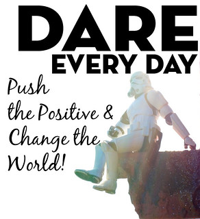
 Hence the Storm Trooper is back! And I know, I know! Storm Troopers are BAD (for now!) - I believe in redemption arcs! Besides, they look cool. Sue me, I've always loved the Trooper. And I love how being a Trooper means to be a "reliable, often a hard-working person." Like me!
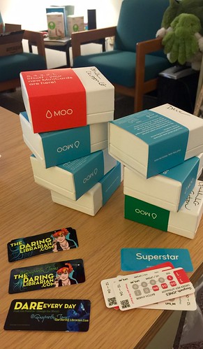
But what the HECK am I gonna do with 400 Cthulhu mini business cards now!? LOL Sheesh!
Therefore, I'm playing with new graphics for this blog, Twitter, & my Mini Moo business cards. If you see me present at a conference nearby - don't be surprised if you get one! Heh heh heh did I also mention I'm thrifty?
Head Banners
Also, don't be surprised if you come back here and see a different banner head to this blog o mine. I've had a few of them! Collages can become addictive, dontcha know?
Blog post banners are important. It's like the cover of a book, it catches the eye, it makes you want to read the post. Or it should! When I was writing about the 11 Reflective Blog Tips & Tricks a few months back #5 was Get Graphic. I think the simple act of adding a header graphic to a blog post a few other graphics in the post makes your blog more enjoyable and readable. I LOVE graphically rich blogs! Heck I blogged once about my problems with Font Lust & Graphic Desires and I even have a eponymously named Scoopit page of resources!
Why I'm NOT Dynamic....YET!
And yeah, you would think someone as passionate and opinionated as I am about Font Lust and the importance of GREAT graphic design in your school, on social media, and definitely in presentations would have adapted a new dynamic template to this blog, right? But I haven't. I like the look. It's traditional bloggy and reads well on mobile devices. Also, all my past blog headers wouldn't look good anymore and I'm NOT going to re-design hundreds of graphics. I'm not that crazy - or I am that lazy! LOL What do you think?
If you're curious, what's REALLY stopping me is the worry that all my older posts have non-square graphic blog post headers and might not visually make the template transition and conversion well and just end up looking stooopid!
Ok, so this might be a big long fluffy blog post about an ephemeral topic, but I just thought it had to be said. Or explained how I went from the Tardis to Trooper! Oh and I credit Jennifer LaGarde for bringing Kristina Alexandderson and her Storm Trooper Flickr Creative Commons photos into my life ....and my blogs, and keynotes!
So, stay tuned for more.....more pics, more branding, more opinions and opining! Thank you dear readers!
Now it's YOUR turn! What do you think of branding? Am I crazy with all this?



You are not crazy with the branding..."personal brand" is a social contract. I sell warmth & wit. That's what you can expect from me. It's also what a naturally put out. People may struggle with brand because they don't know how to sell who they are. Maybe, too, people aren't comfortable because they don't know themselves. Branding gives us a chance yo try on things yo see if they stick. Kids learn branding from 7-13 constantly. William Corsaro (sp?) discusses this lightly in IR (Interpretive Reproduction).
ReplyDelete